
The hardest part of apartment hunting in Japan is often not finding listings. It is reaching ten open tabs and still being unable to answer a few practical questions: Is this apartment actually right for me? How far is its price from the local market? How much cash will moving in require? How should I trade commute time against space, building age, pet rules, and station distance?
Japan Rental Analyzer is designed for that stage. It does not replace SUUMO, LIFULL HOME’S, athome, or Yahoo! Real Estate, and it is not a site-wide listing aggregator. You paste the detail page of an apartment already under consideration, and the tool turns scattered information into a report that can be compared and tracked.
Source code: github.com/panda-pig/Japan-Rental-Analyzer
Start With One URL, Not Another Long Form
The current version supports detail pages from four major sources:
- SUUMO
- LIFULL HOME’S
- athome
- Yahoo! Real Estate
After a URL is submitted, the app extracts rent, management fees, deposit, key money, floor area, layout, floor, building age, walking time to the station, and major amenities. Viewing, contacting, and applying for the property still happen on the original site; Japan Rental Analyzer concentrates on the analysis between discovery and action.
This makes the workflow useful without forcing a new search habit. Keep browsing on familiar platforms, then send only serious candidates into the analyzer instead of copying every field into a spreadsheet.
Eight Dimensions Make “Right for Me” Explainable
The same apartment is not equally good for everyone. One person may exchange a longer commute for more space. Another may prioritize pet permission or a low move-in bill. The project therefore evaluates eight personal dimensions instead of simply sorting by rent:
- Budget
- Floor area
- Commute
- Floor level
- Pet policy
- Station distance
- Building age
- Initial cost
Each dimension is normalized and combined into a 0–100 score using configurable weights. If the optional commute-time service is not configured, that missing dimension is removed from the effective weight total instead of penalizing the apartment.
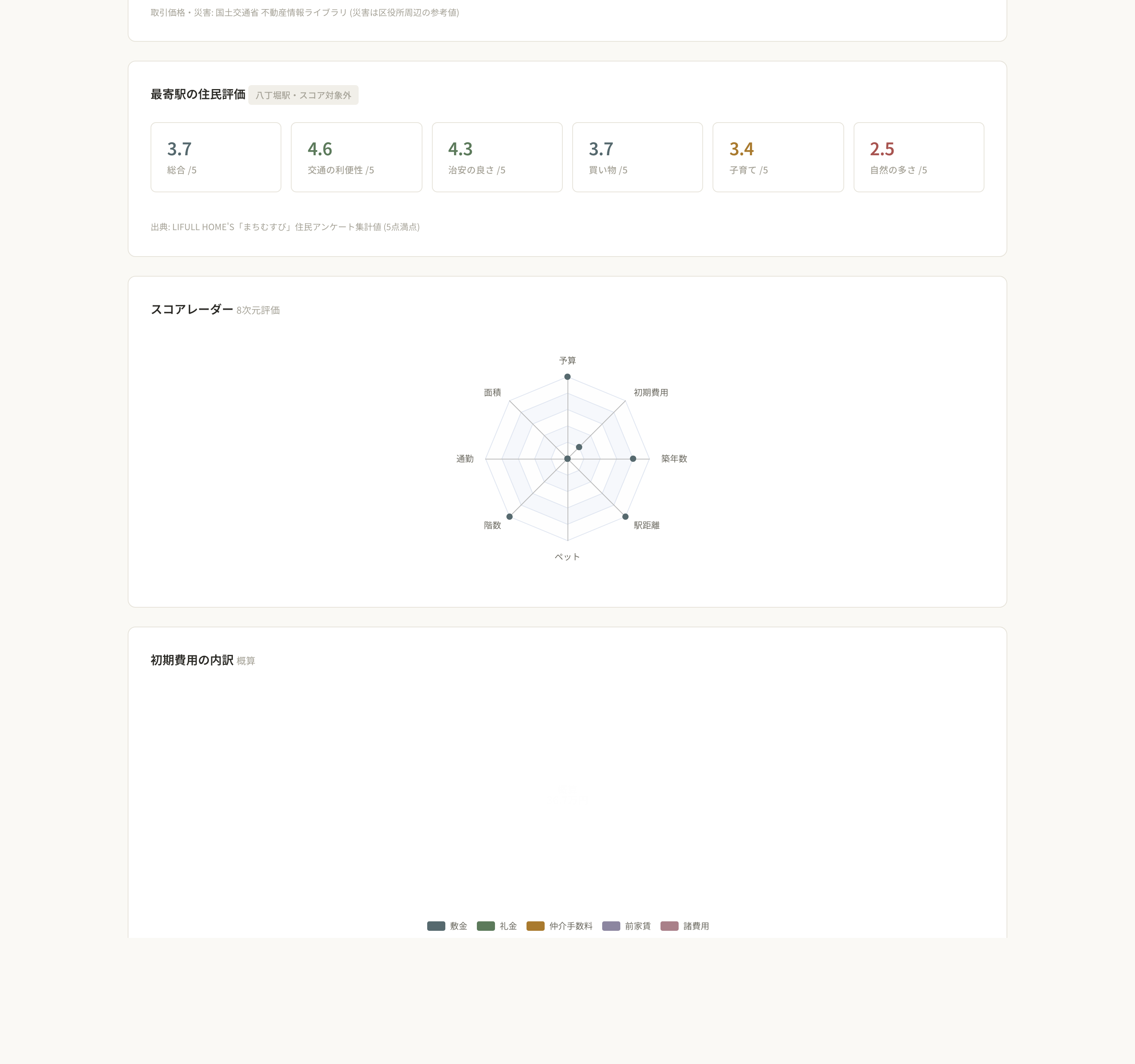
The score is not meant to declare an objective winner. Its value is making trade-offs visible. A radar chart shows where a property is strong and where compromise is required, while personal weights make the result reflect an actual life rather than a portal’s default ordering.
Monthly Rent Is Only Part of the Cost
The largest number on a listing is usually the rent, but two other questions matter.
First, how does that price compare with its area? The report places the monthly total next to the local average and shows both the yen and percentage difference. It cannot replace a detailed comparison of layout, age, and exact location, but it quickly flags candidates that are unusually expensive or worth investigating.
Second, how much cash is needed before move-in? The app estimates deposit, key money, brokerage fee, advance rent, and other common charges, then breaks the total into a chart. For a newcomer to Japan, a budget-constrained move, or anyone also buying furniture and paying a guarantor company, this can matter more than a small monthly difference.
When the same listing is fetched again, its price is added to a history. A vague memory that “this may have become cheaper” becomes a visible change over time.
Public Data and Resident Experience in One Report
A portal page mainly describes the room, but daily life also depends on the area and station. Japan Rental Analyzer adds three kinds of context:
- Median condominium transaction price per square meter and transaction count from Japan’s Ministry of Land, Infrastructure, Transport and Tourism Real Estate Information Library
- A regional flood-depth and landslide warning-area reference
- LIFULL HOME’S Machimusubi resident ratings for transport, safety, shopping, childcare, and nature
These values are display-only and are not silently mixed into the property score. That separation keeps authoritative-looking public data from overriding personal priorities and makes it clear which numbers are preferences and which are external context.
The current hazard indicator is an area-level reference derived around the ward office, not a building-specific risk assessment. Before making a decision, users should still check official hazard maps, review the legally required disclosures, and ask the agent or property manager.
The Property Pool Remembers What Open Tabs Do Not
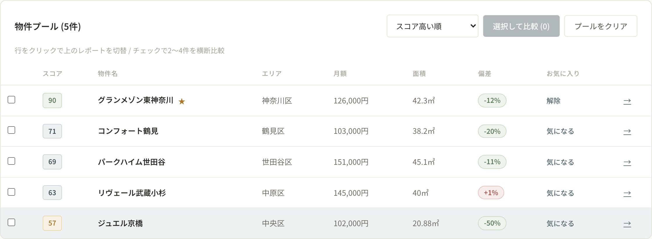
Every analyzed property enters a pool. It can be sorted by score and reviewed in a consistent table showing monthly cost, floor area, market deviation, and favorite status. Selecting a row switches the report to that property.
The project also provides a floor-area-versus-monthly-cost scatter plot, layout distribution, and a visual word cloud of listing features. Patterns that are hard to notice one apartment at a time become obvious as the pool grows: a preferred area may be stretching the budget, saved listings may consistently sacrifice space, or the same amenities may appear again and again.
Compare Two to Four Apartments Side by Side
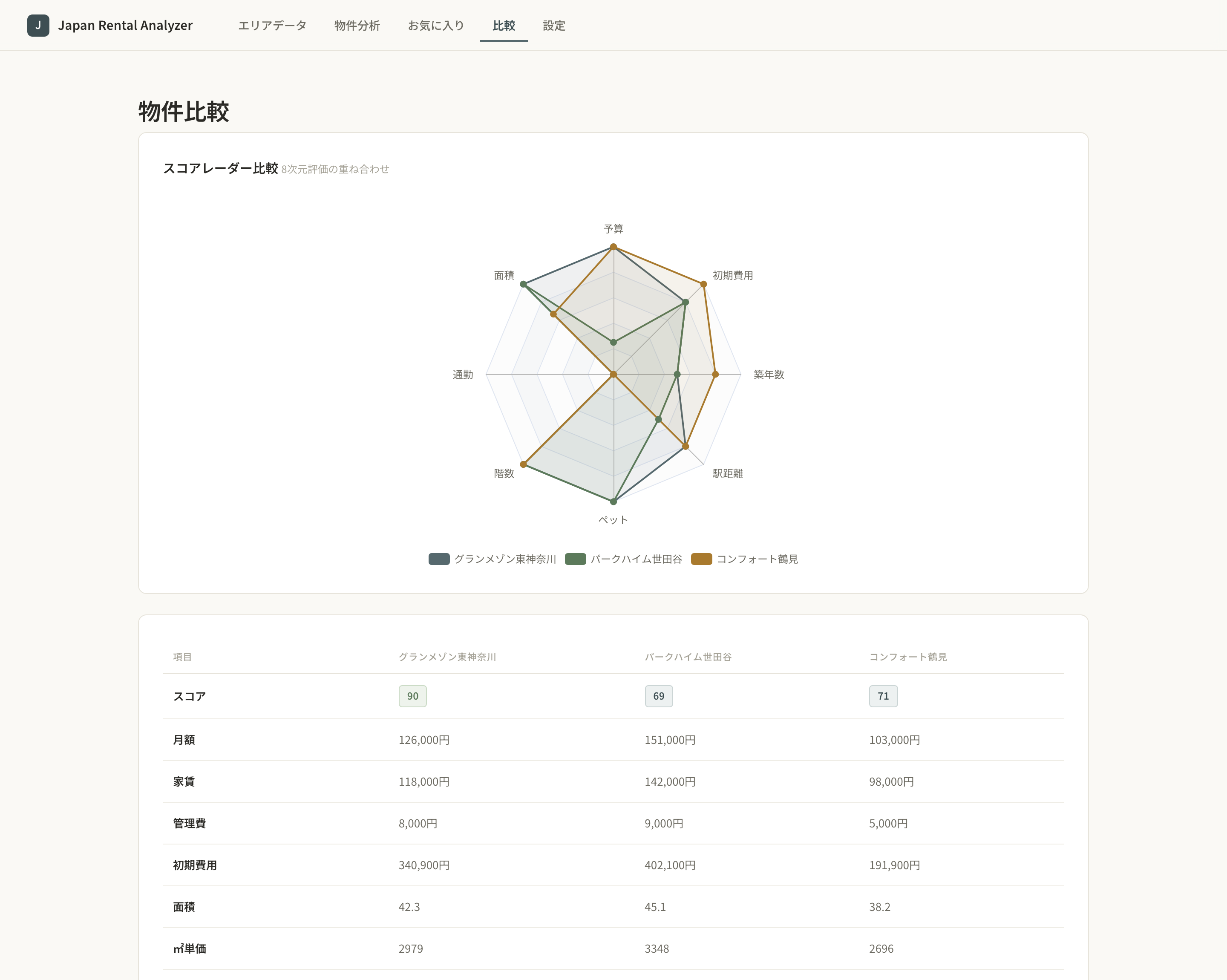
Two to four properties can be selected from the pool for a dedicated comparison. The overlaid radar chart reveals the shape of each trade-off, while the table aligns score, rent, management fee, estimated initial cost, floor area, price per square meter, and other conditions.
This is more reliable than jumping among portal tabs because every item appears in the same place and uses the same calculation rules. A property can also be favorited and moved through consideration states such as interested, viewing, and application, allowing the analysis to support the next action instead of disappearing after one look.
Start With Areas When There Is No Shortlist Yet
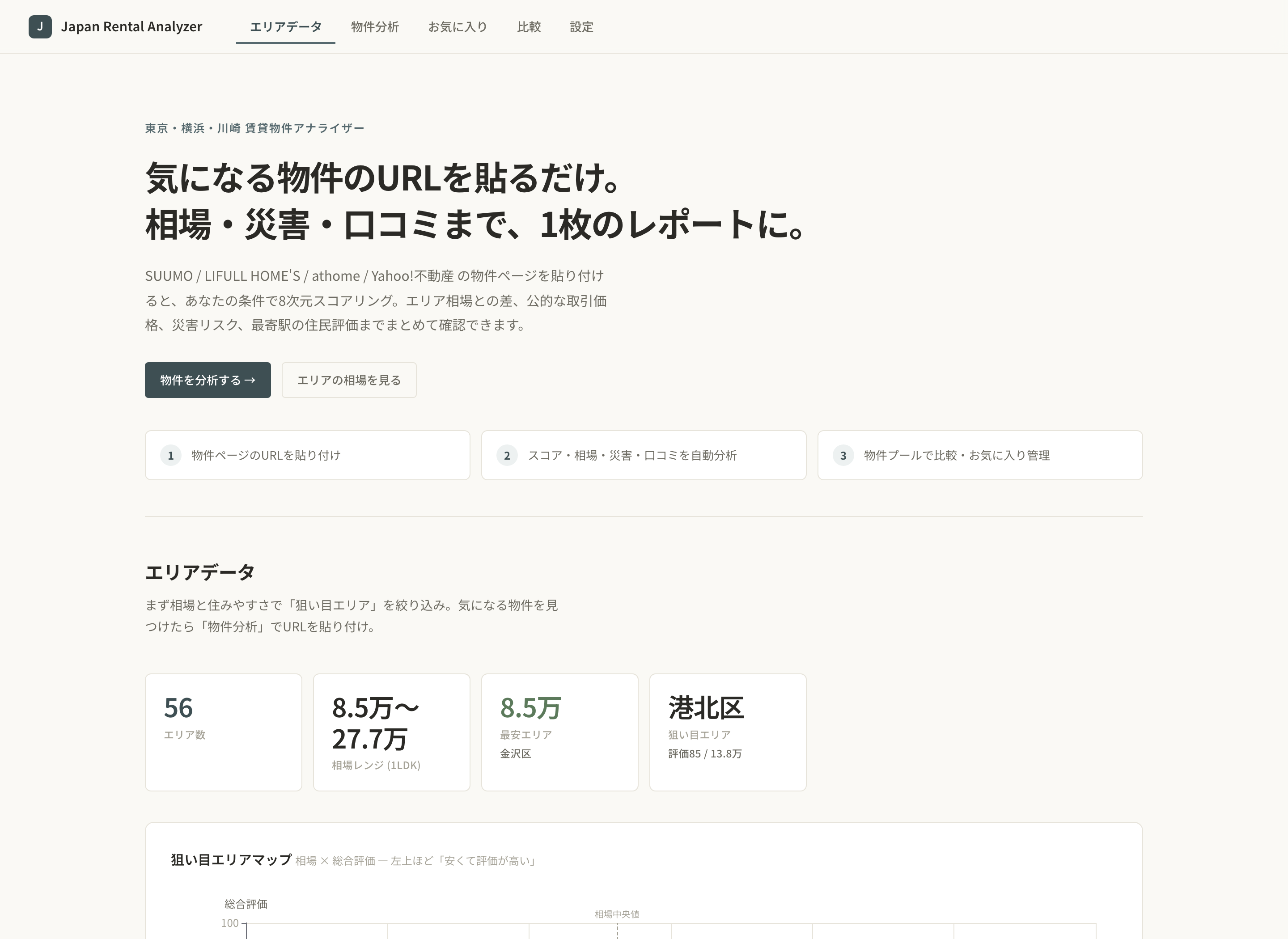
Before a shortlist exists, the area page helps reduce the search space. The current dataset covers Tokyo’s 23 wards, the wards of Yokohama and Kawasaki, plus several major cities—56 area records in total—and provides:
- Average rent and area rankings
- A market-rent-versus-overall-rating opportunity map
- Multi-area radar comparisons
- A sortable full area table
It is useful for asking a better search question—such as which areas balance transport and environment within budget—instead of expanding outward from famous station names without a clear reason.
The Practical Value Is the Complete Decision Chain
The most useful part of the project is not any single chart. It is the way previously disconnected actions form one flow:
- Discover a listing on a familiar portal
- Paste its URL and generate a personal report
- Review market context, move-in costs, public data, and resident ratings
- Keep candidates in the property pool
- Compare two to four apartments directly
- Favorite them and manage viewing or application status
Technically, the app uses Python, Flask, SQLite, Jinja2, Vanilla JavaScript, and ECharts. A listing is fetched only when the user explicitly submits its URL. The project checks robots.txt, waits between requests, does not bypass CAPTCHA, and does not store review text or personal information.
Who It Helps—and What It Does Not Replace
Japan Rental Analyzer is most useful for someone who already has candidates from Japanese rental portals and wants one consistent way to organize and compare them. Its area view also gives people at the beginning of a search a more structured starting point.
It remains a decision-support tool. Scores depend on personal settings, move-in costs are estimates, market figures are regional summaries, and hazard data is not a building survey. A final decision should still verify the original listing, contract terms, and official hazard information, then use an in-person viewing to judge light, noise, surroundings, and the real walk to the station.
The tool does not remove every uncertainty. It turns information scattered across tabs, notes, and memory into an explainable answer to a much more useful question: “Why does this apartment fit me better?”
Enjoy this article?
If you found it helpful, consider supporting my work.